Thursday, November 5, 2009

basic shapes


A family of animal characters were created by combining the square, circle and triangle. The characters were silk-screened to a 1680 X 500mm modernist growth chart for kids.
Honest, pure and devoid of superfluous details, the product imaginatively introduces kids to basic geometric learning and spark the imagination through the inclusion of memorable animal facts.
The charts are compactly packaged in custom triangular cartons made from 100% recycled post consumer waste pulp. They can be purchased at COÖP or Design Within Reach

Tuesday, November 3, 2009

Why tangible?


Story 1: Fascinated by intangible digital technology

Bill Moggridge is a co-founder of IDEO, a 'global' design consulting firm. In a documentary film 'Objectified,' he talks about his, and arguably the first laptop computer design from 1980s; he explains several features that he added to this laptop such as popping-pencils-out cover or an angled stand on its back, and how smart he thought of himself to come up with those solutions. While using the computer, however, what had become more visible to him was intangible elements behind tangible elements he carefully designed. That is, nowadays, called interaction design or intangible interface design. Wii game, touch screen, and internet are offsprings of this field of design.

So interaction design is really big these days, right? Everybody wants to own these cool gadgets that blow up their mind...


Story 2: Back to tangible!


There are designers and artists who refuse to be addicted to intangible digital media, and attempt to evoke the actual senses of people. Here are some examples:


1)Fruit Juice Packaging by Naoto Fukasawa at the Exhibition, Haptic-Awakening the senses curated by Kenya Hara


2)Gel Remote Control by Panasonic Design Company at the Exhibition
Haptic-Awakening the senses


In this book, authors questions:


I find the answer from a French Sociologist, Henri Lefebvre. He said in his book, Dialectic Materialism, written in 1920s:  


Humans are beings of flesh-and-blood, and this physical connection to the nature requires tangible experience as the essence of human existence.

Tuesday, October 27, 2009

Form follows function.


Form follows function. When I was way more ignorant of design than now, somebody hysterically shouted this phrase at my face as if he knows about design. I barely remember how he explained this way-to famous-to-be-understood-as-it-is sentence. Yes, we were talking about design, drunk.

Although some time has passed since then, I still recall that moment. Why form follows function? Did he really know what he meant? For some people, it is the ultimate guideline of design, for others, it is as old as a fossil. I was confused with it, because I didn't know how to read it.

This morning, I happened to read first few pages of a book, Architecture and the Spirit of Man, which I read few chapters before, and put aside. The first chapter, What buildings are beautiful, had some insights on aesthetics of buildings. It made me to rethink and analyze my thesis, which is about designing for invisibility. So I continued to read more.
Form follows function; the form of a building must be a consequence of its purpose.* 


This is a common understanding, and also that of a surface. Read the following sentence.

The form of a building must tell the story of its life, of its inward activities and outward affiliation.*


The story that reflects people's life and their use of objects needs to be embraced in the form. As a sentence, form comes before function; this order confuses me to read its meaning properly. However, in a real life, the form and function of the building or the object advance dialectically not consequently.


Dialectics is the method of argument, which two opposite characters develop integral relationship. When you think of dialogues, it is easier to understand. Two or more people make series of dialogues in order to explore a particular subject, and solve a problem. Good design or long-live design embraces this dynamic of dialogues of the form and function; they are open for change. However, the famous Form follows function mistakenly indicates a consequential relationship, A follows B, make people confused about the idea behind the sentence.


*Joseph Hudnut, Architecture and the Spirit of Man, (Harvard University Press, 1949), pp12

Thursday, October 1, 2009

Ampelmann and traffic light design of the world


Today I was waiting for the traffic light to change in front of Rochester downtown Java's, and starting to think about designs of traffic light that I've seen. When I traveled to Berlin, Germany, the first thing I recognized was its unique traffic light. (I stayed in my friend's apartment which was located in the east side of Germany.) I instantly fell in love with it. It seems I wasn't the only person who liked its cute look; there were shops called Ampelmann ("Traffic light man" in English) selling bags, t-shirts, posters and other souvenir products using ampelmann as its mascot and the graphic element. I regret that I didn't buy anything besides a poster..yes, I was a cheapstake. Anyway traffic lights seems so ordinary to urban dwellers but there are subtle differences among them which interest me so much. Here are some more examples that I found from Ampelmann's website and The Columnist Manifesto:


Above: Taiwan- We have similar number counting signs in Korea. I get nervous when I see the number counted down. That wobbly green guy seems nervous too!


Above: Holland- Strangely I never noticed this black and white post of traffic lights when I lived there. I guess I jaywalked too much in Holland.


Above: Ampelmann shop in Germany

Bonus story: In Korea, we call green light blue. I don't know why we do that, but we learned to call it that way; Red to stop and blue to go. However what we actually have on Korean streets are green lights. I wasn't aware of this until one of my dutch friend looked at me strangely when I was shouting "blue, blue, blue" in front of traffic light, which actually meant green.:)

Metaphys Celtis board game


Designed by Chiaki Muratoof Metaphys


Celtis' form and function are not too different from other board games (e.g Gemblo) However its subtle beauty caught my eyes. It would actually feels nicer to play with since a player can move gems so easily. Each gem reminds me of a pebble and that of Korean cheker, Baduk, shown as below.


.

Muji Bath Radio


Designed by Industrial Facility for Muji

This is a radio that can go with Muji shampoo and conditioner bottle as if it is part of the health and beauty products. I love its simple and humble aesthetic. Although it looks more organized with the brand products, it will also look fine with other beauty products. Sadly, this is only avaliable in Japan.

Thursday, April 23, 2009

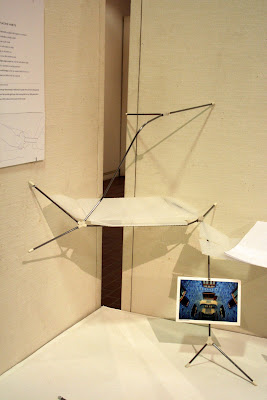
Design for Invisibility To place Things Better


Successfully completed my thesis show last week.:) Now it's time to refine some details and get ready for the final defense.
To see more images,click here. 

LinkWithin

Related Posts with Thumbnails